Deciding on a colour scheme for your new kitchen design is as much about the size and shape of the room as it is your preferred colour palette. In this short guide, we will explore how to choose a colour scheme that compliments and flatters your kitchen design layout, as well as being in line with your personal style and preferences.
Essentially you can choose any colour scheme that you like and apply to any room in your home, but you should carefully examine the size, shape and the amount of natural lighting that the kitchen receives before taking any action. If you have a small or narrow sized kitchen that gets minimal natural light, any dark shades will make the room feel depressing and unwelcoming. Therefore, you should pick a light colour scheme, as this includes elements of white within the colour, making the room seem brighter, even when there are touches of darker shades are incorporated in the overall design.
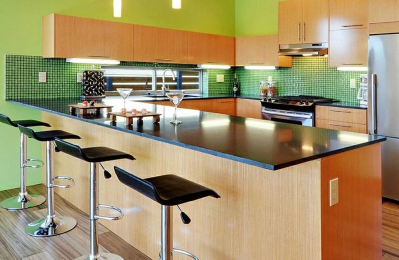
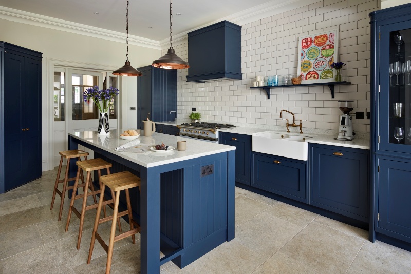
Those who have a larger sized kitchen that features lots of natural light can experiment with darker colours, as the amount of light and space the kitchen has will ensure the room still feels spacious. In fact, applying too much to many bright colours to a kitchen of this size may make it seem scattered, meaning light shades should be balanced with warmer colours and darker tones.
Choosing a Colour Scheme: Understand How Colour Palettes Work
The first step when choosing a colour scheme for your kitchen is understanding how and why certain colours complement one another.
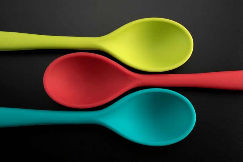
The biggest key to choosing a great kitchen design is also the simplest; using a colour wheel. You might think that they are only for art lessons in school classrooms, but colour wheels are an excellent way to help you to understand what colours match well together.
There are two fundamental ways to use a colour wheel to decide on a colour scheme, and these are complementary colours and analogous colours.
Tips for Choosing a Colour Scheme for Your Kitchen
Complementary colours are two colours that are on opposite sides of the colour wheel. If you are planning to redesign your kitchen or change the colour scheme, then knowing which colours are complementary to each another can help you make good colour decisions. For example, complementary colours can make each other seem brighter, they can be mixed to create effective neutral hues, or they can be combined to create a shadow effect.
The Basic Complementary Colours
At the heart of colour theory, complementary colours are the opposite hues on the colour wheel. For example, the complementary colour to yellow is purple, which is a mix of blue and red.
With that knowledge, it is rather easy to remember the first set of complementary colours:
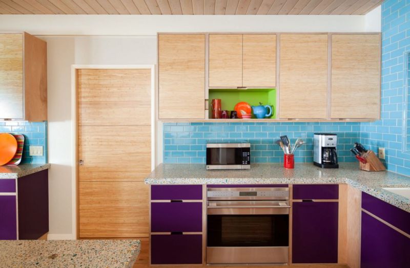
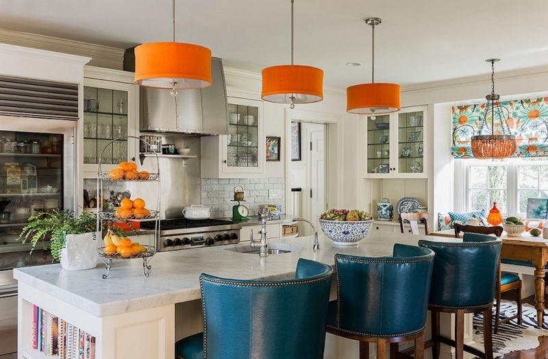
- Blue and Orange
- Yellow and Purple
- Red and Green
If you add the tertiary colours, those made up of one primary and one secondary colour, and work your way around the colour wheel, you will find that these colours are also complementary:
- Red, Purple (Pink) and Green, Yellow
- Yellow, Orange and Blue, Purple (Indigo)
- Orange, Red and Blue, Green (Aqua)
The colour wheel can be divided an endless number of times to include all gradients in between these basic hues. What is most important to understand is that no matter the shade or tone of the colour, the contrasting colour is always going to be it’s complementary.
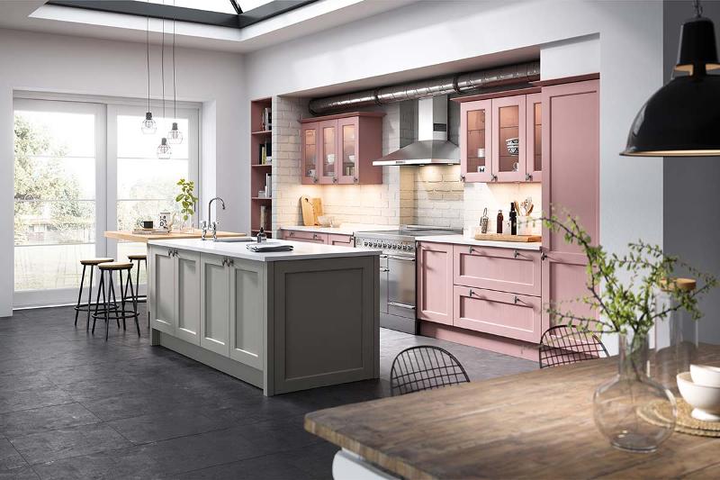
Analogous Colours
Analogous colours are the easiest to find on the colour wheel. Pick any colour at any point on the wheel. Then, take note of any three colours directly to the left or right of it. As a collective, those four are a group of analogous colours. Analogous colour schemes are a popular choice amongst people when choosing their new kitchen designs.
Striking a Balance with Analogous Colours
Kitchens that feature analogous colour palettes often have a peaceful and symmetrical feel. When decorating with these colours, it is important to strike a balance between the tones by choosing a primary one to focus on. This will be the dominant colour of the kitchen, which will allow you to bring in the other shades as accents.
Creating a Contrast with Analogous Colours
When designing your kitchen, it’s always good to make sure that you get the most out of an analogous colour scheme to create a contrast. With the colours in your palette so closely associated with each other, it’s easy for them to be combined with one another, resulting in a chaotic look that can often be visually overwhelming. Luckily, there are several different ways to avoid this. Picking a focal colour is one; creating a distinction between your colourful pieces with a pattern is another way. One of the best ways to do this is by balancing the level of your chosen colours, making small, medium, and large colour choices to create an even blend of tones throughout the kitchen.