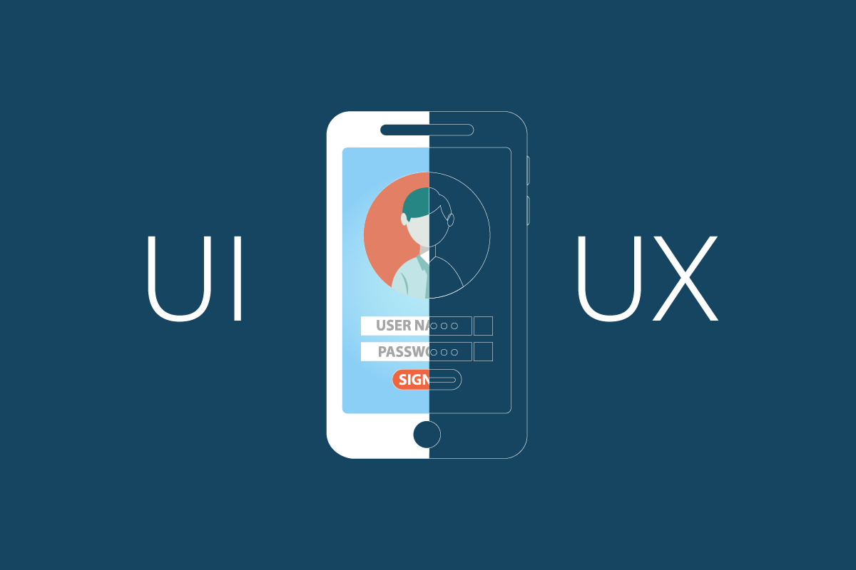
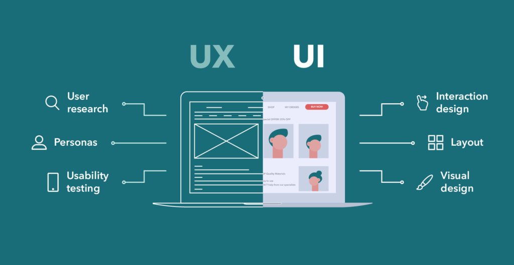
More and more people choose UI/UX design because they see themselves as in-demand specialists who want to promote non-standard ideas, solutions and put them into practice, learn from the best, develop and create nice-looking and easy-to-use sites, applications, and so on. But many of those who come into the field of web design face not the difficulties, but the first mistakes, the consequences of which have a negative impact on the perception of their work and themselves, reduce productivity, spoil relations with the client.
Most of the failures of beginners can be divided into two categories: professional and personal. The first are those that are directly related to design creation, with layouts, edits, design elements, and so on. The personal ones involve the area of motivation and self-criticism. Let’s take a closer look at what common mistakes we’re talking about.
Professional mistakes
Unnecessary Complication
Think about it, does a person open your site to look at beautiful illustrations? Or be surprised by an unusual menu? A person coming to a website, more often than not, just wants to fulfill their needs. For example, to quickly order a pizza. According to the research conducted by JatApp software programming , over 75% of users said they would rather not go back to a site whose design makes them spend more than necessary on it. Yet, beginner designers like to complicate things that can be left “trivial”, or copied from other projects. But do not be afraid to pay attention to competently implemented cases of successful competitors. This is a step towards understanding what you should keep and what you should work on.
Adding each new design element, ask yourself whether it brings a specific benefit to the client. There’s no need to add anything unnecessary; make sure the design remains consistent and clear.

Lack of focus on the key action
The site, as a good partner in conversation, is always perceived better if he clearly articulates his advantage. Ask yourself what you offer, what path the user takes on the page, what key action he has to take. Clearly lead him to that action. For example, you can use the five-second test. Show the layout briefly to a friend, and then ask him what he understood about the site. Did he understand what the system allows him to do, what it offers?
Visual Noise
Remember that the attention that a viewer is willing to spend on a site is limited. Imagine that attention in the form of a glass of water. With each new design element, it’s as if we’re taking a sip.
Beginning designers get carried away with the tools and make pages “noisy,” low-contrast, and oversaturated. Instead of a light gray background, try making it a clean, white background. When adding a new dividing line, try how the design would look without it.
Inconsistency
Often each new page of a website looks like a new site. So when creating a new header, text block, or form, consider whether you can use a ready-made block. A creation form, for example. Always, if possible, repeat the graphic techniques already used. This will give a person a proper understanding of how the element works, and will speed up the process of developing your idea by programmers.
Non-universal solutions
Designers love big displays, the most accurate color reproduction. Working behind a monitor, we forget that our website or mobile app will be used in a completely different, much more varied environment. The site would be open in all sorts of browser sizes, from 320px to 2500+px. The mobile app will run without an internet connection, perhaps even being used on the run. Try to think ahead, consider completely different ways of working with your product. Best of all, test more.
Personal
Self-fulfillment by all means
Often newbies go the route of “I want to make it to my liking” instead of listening to the customer. This is understandable, because after we finish training, we want to enjoy our newfound skills, so we use them to the best of our ability. But we often forget that our “beautiful” can go against the client’s understanding, and they are the ones who need the project. It may seem surprising, but the client pays for the realization of their own ideas. We help them do that, but we are not the final decision point. So listen to your customer.

Unnecessary stubbornness
The first projects, especially those in which much effort has been invested, are a personal achievement of the designer, you can not criticize them. So make a distinction between layout and personal evaluation. The best exercise is not to persist and give the layout to someone else to evaluate it, and you move on to other projects and not be afraid to do new and different variations.
Too much attention to detail
Beginning designers can get caught up in the part that they personally like. For example, the main illustration on the site, beautiful icons – anything that is of interest and value to the designer, but diverges from the business goals.
Ask yourself how any action you take will help your client’s cause. Is it worth investing another 16 hours to improve a single illustration on a website? What more important things can we do in the same amount of time? Perhaps it’s much more useful to get the site out quickly, gather opinions from a live audience about what’s missing, and then finish the nice little things.
Not knowing your price and value.
You can, of course, work for free, but sooner or later it comes to pay. At this stage newbies often get lost. There’s a quick universal solution: divide your monthly payment by 168 – and get the value of your desired compensation per hour. Multiply that cost by the estimated duration of the project and call the total.
For example, you plan to make a promo site in 5 working days, i.e. 40 hours. You would like to earn $800 a month to start with, so the cost of an hour of work is equal to $4.7. Then such a job could cost $190. Don’t be afraid to take 20% on risks, something always goes wrong. The bottom line is about $230.
Self-Criticism
When a beginner starts to get good at it, the first joy is often replaced by panic. “After all, the design gurus do better!” you could often hear. “My layouts aren’t as great, nothing comes out!” Self-criticism often stops further development. Be as self-indulgent as possible, constantly doing something new. The good news is that even the best designers are guided by new work in their field when starting a project. Let self-criticism be a warm fire of motivation, not a destructive fire.


