Looking at a house with colour-matched furniture and décor gives off an aesthetic appeal like no other, satisfying homeowners and guests alike. For example, sofas that match colours with the coffee table create a harmonious look that’s pleasing to the eyes. If you’re looking to achieve a colour-matched look in your living space, here are four top tips to help you in this regard:
Use The 60-30-10 Rule
Many homeowners think that balancing the colours is always going to be an even 50-50 split. But, achieving a complete balance between two colours can be challenging. Moreover, it’s not going to give you a lot of room to work with for the colours (no pun intended).
Instead, opt for the 60-30-10 Rule. This particular guideline allows you to use up to three colour tones in your house. It means that you should use 60% of your primary colour, 30% of the secondary colour, and 10% of the accent colour.
For example, if you’re considering to implement bright interior colours, like pastel tones, use a colour guideline like the following:
- 60% grey
- 30% sky blue
- 10% heavenly pink
You can use different combinations of these colours, as long as you achieve the correct ratio between the tones. For instance, the walls can be grey, whereas your other pieces of furniture and décor will project the sky blue and heavenly pink colours.
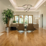
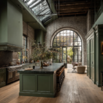
Coordinate The Flooring With The Furniture And Décor
The eyes often find the largest item in a room as soon as one walks into a space. Hence, you should pay importance to the colour of your flooring when matching tones with furniture and décor. Note that you might get weird looks if you or your guests see the floor and it doesn’t match the other pieces of furniture in the room.
One excellent example is to match the furniture and décor with the type of wood used for the flooring. So, if you have cherry wood for your floors, try to match the tables, chairs, and other woodwork in the area with the flooring material. Achieving this look will create a harmonious blend of colours and textures, providing a rustic, weathered, yet smooth finish across the space.
Still, you don’t have to follow the flooring’s colour in choosing your furniture and décor. For instance, ash flooring has a pale brown tone. It doesn’t mean that your chairs, sofas, and table should bear the same pale brown colour.
Instead, you can incorporate the 60-30-10 Rule here. Consider using analogous colours in choosing or painting your furniture and décor. So, if the floor shows a pale brown, consider buying or painting the rest of the room with pale reds, oranges, or whites.
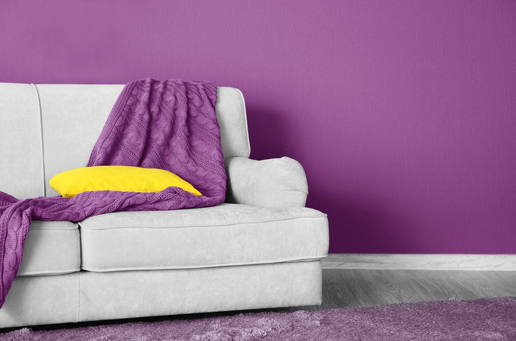
Contrast The Brights With Mutes
A room brimming with vibrancy can hurt the eyes. But, staying in a room with nothing but muted tones can become boring.
Instead, consider mixing these two colour categories to create balance. Start by choosing a neutral colour, such as beige, grey, or taupe. Then, add one or two bright colours, like green or purple. If you see any other areas of concern in the room, enhance the look of the space with accent colours.
Note that mute or neutral tones are a practical and safe choice for creating colour balance in your home. But, “safe” may not always be an ideal solution, especially if you want your rooms to stand out.
Moreover, the accent colours should complement the neutral and vibrant tones. For example, if your floors or walls are pastel blue, think about using items, like pieces of fine art decorated with mint, navy, or turquoise hues.
Try to avoid releasing your inner Picasso as you try to colour-match your rooms with different furniture and décor. Bold combinations may clash sharply, and the overall result will look gaudy and unappealing.
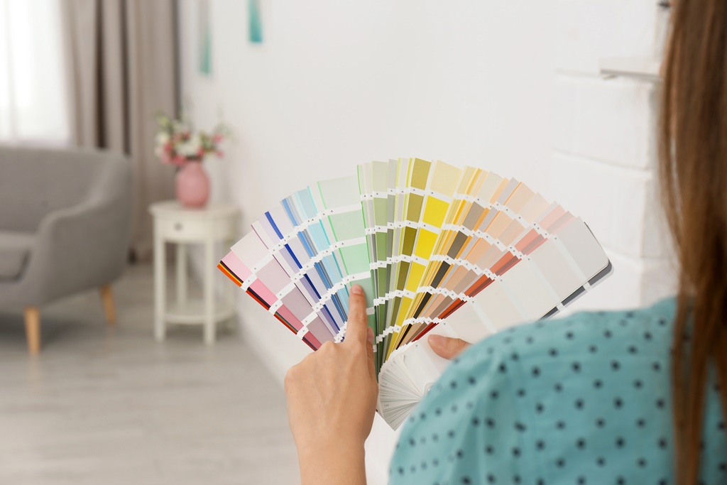
Know Complementary Colours
If you find it challenging to mix and match colour-complementing furniture and décor, perhaps, you might need to do some research first. Picking colours at random may only lead to disastrous results.
Know that specific colours complement certain hues. Clashing colours, such as red and green, might be an excellent choice for festive seasons, but not for the entire year.
So, here’s a quick guide to help you choose which colour to use for your furniture, décor, and other areas of your home to create and maintain colour balance:
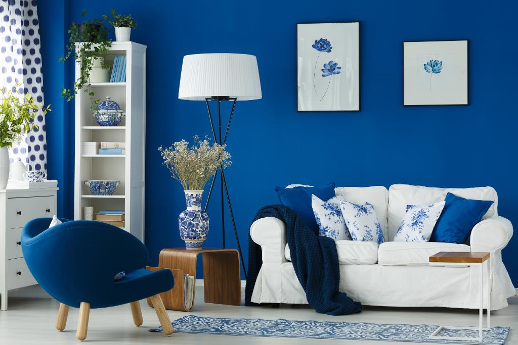
- Blues – A predominantly blue room may help release stress and tension from the mind. But, it can also exaggerate sad feelings. Hence, it’s wise to mix blue tones with accent and secondary colours, like off-white, lime green, and gold.
- Greens – Like blue hues, green colours also promote calming vibes in homes. But, greens won’t create gloomy feelings. Nonetheless, consider combining green tones with the likes of navy blue, red, grey, brown, and purple for a harmonious tonal blend.
- Greys – You can never go wrong with neutral or muted colours, especially when you’re considering grey as the primary colour. Since this tone is a neutral shade, consider matching it with vivid colours to make a space seem “happy”. Otherwise, you can mix grey with other neutral tones with white and off-white for a minimalist look.
- Pinks – The colour pink is a light shade of red, but it doesn’t share the same aggressiveness as its darker counterpart. Use colours green, red, blue, and mustard for your furniture and décor if your home has a predominantly pink colour.
- Reds – Be careful when pairing other vibrant colours with red as this tone is quite aggressive to the eyes. Nonetheless, reds promote feelings of energy and warmth, making these tones ideal for places like kitchen and dining rooms. Combine red walls with earth tones, like brown and green, to help induce appetite.
Conclusion
Don’t just aimlessly throw furniture and décor around a room and expect to achieve a colour-balanced look. Use guidelines, like the 60-30-10 Rule, or take advantage of a colour wheel to help you choose the right tones for your home. If you’re not in a hurry, take the time to plan the appearance of your space. Rushing without proper consideration may make you feel dissatisfied with the results.