Most homes look “fine” after a repaint. But a well-chosen colour combination can make your rooms look larger, warmer, and more premium, even before you change the furniture. In 2026, the biggest shift is simple: colours are getting softer, richer, and more comforting.
Instead of harsh contrast, people are choosing pairs that feel calm in daylight and cosy at night. Add a feature wall with texture paint, and the same space starts to look thoughtfully designed, not just freshly painted.
Basic Understanding of 2026 Colour Trends
Colour combinations work best when they balance two things: mood and light. A trending shade might look beautiful online, but in a real home, it must suit your room size, natural light, and the finish you choose.
In 2026, two clear preferences are shaping wall paints:
- Warmer neutrals instead of cold greys
- Nature-led colours like teal, green, clay, and muted reds
A third trend is finish layering. More homeowners are pairing smooth wall paints with one textured paint wall to add depth without adding clutter.
Trending Colour Combinations for 2026 That Work in Real Homes
Here are key trending colour combinations you should try in 2026:
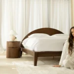
Rich Taupe With Warm White
Taupe is becoming the new everyday neutral. It feels softer than grey and looks premium with warm white. This combination is safe for most Indian homes because it suits both cool daylight and warm evening lighting.
- Where it fits: Living rooms, master bedrooms, long passages.
- Pro finish tip: Use texture paint on the taupe feature wall for a subtle, upscale look.
Espresso Brown With Creamy Beige
Brown is back, but in a refined way. Espresso shades bring depth, while creamy beige keeps the space open and bright. If you like a cosy, hotel-like look, this is a strong 2026 pairing.
- Where it fits: Bedrooms, lounge areas, study corners.
- Pro finish tip: A fine-texture paint on the espresso wall adds richness without making it feel heavy.
Burgundy With Camel
Burgundy is trending as an accent, not as a full-room colour. When paired with camel or tan, it looks warm, stylish, and grown-up. It also complements wooden furniture and warm lighting beautifully.
- Where it fits: Living room feature wall, dining area accent wall.
- Pro finish tip: Keep the camel wall paints smooth and let the burgundy carry the texture paint finish.
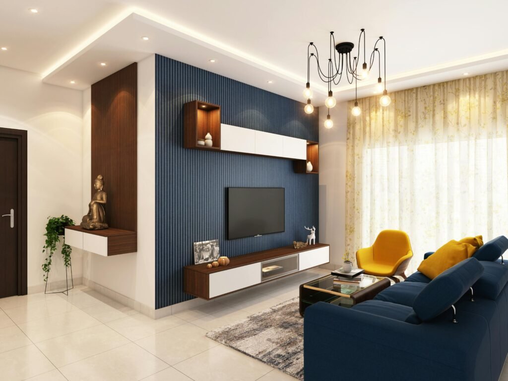
Teal With Creamy White
Teal sits between blue and green, which is why it feels calming and fresh at the same time. For 2026, teal is one of the most popular choices for a feature wall because it looks premium without being loud.
- Where it fits: Living rooms, bedrooms, modern apartments.
- Pro finish tip: Choose a soft texture paint finish for teal to create depth under lighting.
Earthy Green With Clay
This pairing is for homes that want a grounded, nature-led feel. Deep green adds calm, while clay adds warmth. Together, they create a balanced look that still feels unique.
- Where it fits: Dining rooms, entry zones, reading corners.
- Pro finish tip: Clay texture paint works especially well because it gives a handcrafted, warm finish.
Smoky Blue With Sand
If you prefer cooler tones but want them to feel inviting, smoky blue with sand is ideal. It looks calm, clean, and easy to live with.
- Where it fits: Bedrooms, guest rooms, compact living rooms.
- Pro finish tip: Use texture paint only on the smoky blue wall and keep the sand wall paints plain.
Warm Black With Ivory
This is a high-impact combination, but it can still feel soft if the black is warm-toned and used in the right amount. Ivory keeps the space bright and prevents the room from feeling closed in.
- Where it fits: TV unit wall, entry wall, a niche wall in a living room.
- Pro finish tip: Choose a subtle texture paint or a smooth finish for the black, then use matte wall paints for the ivory to keep it elegant.
How to Use Texture Paint Without Making the Room Feel Busy
Texture paint looks best when it is planned like a design element. One textured wall is usually enough for a room. If you do too many, the home can feel visually heavy.
Simple ways to get it right:
- Use texture paint on the darker shade in your colour pair
- Keep the remaining wall paint smooth for balance
- Use finer textures in smaller rooms and bolder textures only in large rooms
- Always check a sample in both daylight and evening lighting
Room-Wise Colour Pairing Ideas for a Cohesive House
If you want your home to feel connected, repeat one neutral across rooms and change only the accent shade. This makes your wall paint look intentional. A clean 2026 flow:
- Living room: Teal with creamy white, or taupe with warm white
- Bedroom: Smoky blue with sand, or beige with espresso brown
- Dining: Earthy green with clay
- Entry: Warm black with ivory
Conclusion
The best trending colour combination for your house in 2026 will be the one that suits your light, your room size, and your lifestyle. Warm neutrals, teal tones, earthy greens, clay shades, and softened reds are leading choices, especially when paired thoughtfully.
Use wall paints to build a calm base, then add one feature wall with texture paint to bring depth and a premium finish. Done right, your home will look modern, welcoming, and well-designed for years.