Whether you’re designing graphic art, a website, or a home interior, color plays a crucial role in creating a balanced and appealing aesthetic experience. Color helps set the tone for a space or a visual, allowing the viewer, homeowner, or critic to tap into the emotions the creating individual wants to generate with their work.
If you’re looking to boost the aesthetic of your home interiors, you’ll need to take a close look at the impacts that individual colors and shades can have on your space, whether with paints, furnishings, tiles, or colorful acoustic panels. If you’re researching color for the purposes of creating artwork, you’ll find plenty of helpful information here as well.
What is Color Theory?
Color theory is the study of how colors and combinations of the same create a particular perception, idea, or mood. Color theory essentially looks at how humans interact with different colors to determine what kind of influence color can have in a specific situation. The hue, shade, tint, and tone are four elements that can change the effectivity or appeal of a particular color, particularly as it interacts with the colors around it.
The Influence of Color
Color can influence us in more ways than we’re aware of, on a subconscious level. Besides creating a pleasing color palette or design combination, individual colors can affect general interest levels, interact with our purchasing decisions, and help convince us whether a particular business or object is trustworthy. Color selection is an integral part of the design project for any type of creative endeavor, whether it’s a new art piece, wall hanging, or interior arrangements. Let’s look at three important groupings that help define particular aesthetics and design elements.

Warm Color Palette
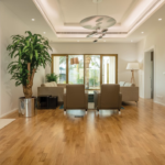
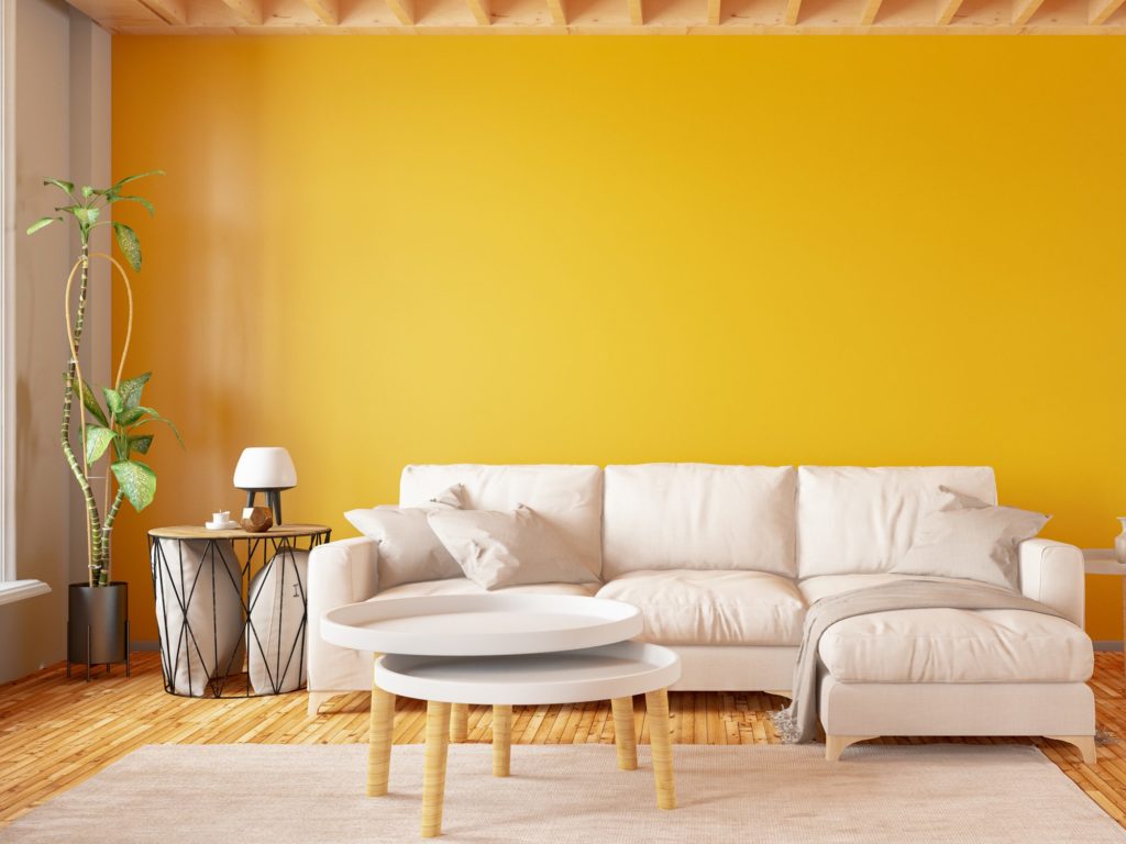
Orange, red, yellow, and certain lighter shades of brown are generally considered to form a warm color palette. Warmer colors look and feel brighter than others, and as such, are generally considered to be the most welcoming. For interior designers, warmer colors make it possible to create a space that feels cozier, and more homelike. However, warm colors that are too bright are often a bit of a detraction when it comes to design. As a result, the bolder side of the warm color palette usually serves better as an accent rather than as a central design component.
Red and Orange
Red emblematizes passion and excitement, as well as heat or fire. In terms of color warmth, it’s first on the list. Using red allows the creator to give their work, whether it’s an art piece or an interior, a higher level of intensity. In many ways, it’s one of the last “relaxed” colors, with the emotions it tends to call up, offering the viewer more perceivable energy. Orange offers much of the same energy but is a bit more of balanced color. The warmth that orange offers is more natural and less intense, calling to mind a sunset rather than something that’s a little more artificial.
Yellow and Cream Colors
Yellow and cream or off-white are pleasant colors for interior design, as they offer a softer warmth than the likes of red and orange. Depending on the shade and hue, the two colors can be significantly closer to neutrals. If you’re looking to add cozy appeal to your work, this is usually the place to start.
Cool Color Palette
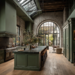
Cooler colors, such as blue, green, navy, and off-white, are the primary contrast to a warm color palette. Cool colors collectively create a calming effect, which helps to relax the viewer or homeowner subconsciously. However, an overabundance of cool color can leave artwork or spaces feeling impersonal, depending on how it’s integrated.
Blue
Blue is the first color most people think of when it comes to “cool colors.” Blue sets a relaxing tone in any visual space or work, reminding the viewer of the ocean and the sky. While blue is sometimes considered to be a melancholy color, its effect is essentially a calming one. The calm and refreshing look that comes with this color works well as a centerpiece of modern art and interior design.
Green
Green, depending on the temperature and hue, offers much of the same emotive representations as blue, but its appearance and shading tend to make it bring a bit more of a grounded appeal. Spruce green is a trendy color for interior designs, particularly for kitchen cabinetry and wall decor.

The Neutrals
Neutral colors are essential for creating a balanced aesthetic and are neither warm nor cool. However, they fit in well with either palette with relative ease. For interiors and modern architecture, neutral colors create a timeless aesthetic that’s designed to ensure it never goes out of style. White, grey, black, and brown are all examples of colors that create a balanced aesthetic with natural tones and hues.
Black and White
Black and white are the basic neutrals, offering a stable balance between a warm and cool color palette. Black brings a sophisticated, elegant aesthetics to any space or artwork and creates intensity with darkness. There are also several psychological effects of the color black. White is lighter, more open, and tends to make the most of natural light, brightening up interiors and artwork without becoming dull or plain despite its neutrality.
Brown
When you’re thinking about colors that you would describe as “natural,” brown is probably one of the first colors that come to mind. The shade and hue of brown change the color’s effect more significantly than other colors.
Conclusion- How Color Influences Aesthetic Appeal
Creating aesthetic appeal with color and color combination is crucial for creating art, graphic designs, websites, and interior designs. The applications of color theory essentially extend to a range of creative tasks and projects and can ultimately change the way people think.