We all want to liven up our homes and add a splash of color. These seven lessons will help you embrace color in a whole new way.
Intro:
Picking out a color scheme is difficult for some people, easy for others.
But that’s only the first step.
Color coordination is the trickier part.
No doubt color is one of the most important choices you’ll make in your interior decoration. It’s not uncommon to get cold feet when it comes down to putting theory into practice.
Nobody wants to get it wrong because a do-over is a whole other business.
Well, good news.
The seven lessons in color we’ve prepared for you will allow you to look at color in a whole new way.
No more room for worries and mishaps.
1. Use the 60/30/10 Rule
Ever hear of the 60/30/10 rule?
It’s a popular decorating rule in interior design that works like a charm.
Here’s how it works:
The 60% stands for your primary color of choice. This one is your base color, and it generally applies to the walls and other large pieces.
The 30% stands for your secondary color and tends to cover most of the other stuff in the room, striking about a 50/50 balance with the primary color.
The last 10% is the subtle color that breaks between the first two, magnifying their appeal. Also called accent color, the 10% is where your creative taste comes in.
If you’re not very experienced or merely want something that’s entirely proven to work, go with this rule.
All in all, it’s meant to make your job easier.
2. Work With Color Groups
Color groups allow you to transition from one hue to another without the risk of clashing.
The idea is to work with different shades of the same color instead of jumping into a completely different color. So, instead of standalone colors, you’re just working within one.
For instance, colors within the purple, blue, and green category count as cool because we associate them with the sky and vegetation.
Working within one color family can come in handy when you’re unsure if you’ll get it right with standalone colors. It also eliminates the chances of color riot.
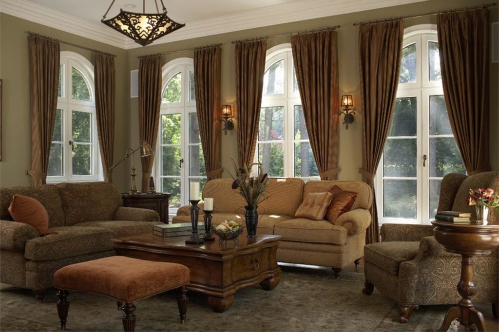
3. Stay Safe in Neutrals
When we talk about neutrals, some people begin imagining gloomy undertones. But that’s a narrow way of looking at it, considering neutrals are quite elegant in their own, unique, understated way.
Think of colors like taupe, ivory, and cream. When layered well, these muted hues can result in one epic transformation.
The best part is that neutrals are easier to work with. They’re laid-back and allow for a smooth transition from one hue to another. You can’t say the same for rich colors, though.
If you want to stay on the safe side, neutrals are your best bet.
4. Trust Your Personality
When it comes to decorating with color, the best guide you have is your personality, as it’ll influence your perspective.
Think about it.
You have a relationship with color. What do you think works for you?
It may not be the right combination, or you may not be great at working with different colors, but put that worry aside for later.
What matters is what you see when you close your eyes. That’s your taste, and it makes all the difference.
Remember this lesson before you even start designing: what you picture in your head reflects your personality.
5. Keep the Space in Mind
Space is a massive factor when it comes to color. Don’t forget to keep it in mind, as it affects the final look.
If you’re wondering about the connection between space color, it has more to do with the feeling it evokes than appearance.
Radiant colors make a space feel light and airy. If you have a small space, that’s all the more reason to have it feeling open. White would be the perfect dominant color to use in this case.
The opposite is also true:
Darker hues will make your space feel closed in. This strategy comes in handy when restraining large rooms but not so favorable to small spaces unless you’re after the super cozy look.

6. Pair Dominant and Subtle Colors
Pairing dominant and subtle hues is an effective way of balancing your color scheme. It can also save you a lot of trouble by steering clear of the dreaded jarring effect.
Think of this technique as an alternative to sticking to one color family. You get to experiment with different colors while still maintaining consistency all throughout.
7. Consider Color Tones
When decorating with color, one of the essentials to keep in mind is color tone. If you get this wrong, you’ll end with a different version of what you had in mind.
Here’s the thing:
Aside from the basic attributes colors have, they also have tones. They can be warm or cool, and this is likely to affect the feeling you’re chasing.
Say you’re going for a cool, laidback look; picking orange or maple will give you the opposite of what you want. Considering these are warm colors, they evoke this active, homey mood.
But what is a warm and cool color?
We describe warm colors as “warm” because we associate them with warm and hot things; the opposite is true for cool colors.
For instance, colors within the purple, blue, and green category count as “cool” because we associate them with things like the sky and vegetation.
And, colors like orange, red, or yellow remind us of sunlight and summer.
Conclusion
Experimenting with colors and stretching the known boundaries is great. You never know which gems you’ll uncover by thinking outside the box.
But keep this one thing in mind:
Many of the established rules in place are there for a reason.
Are you ready to begin your color journey?
[Insert client bio]
Caitlin Sinclair is the Property Manager at REVO with 5 years of property management experience and many more in Customer Service. She shares her passion for her community and looks forward to making REVO a place to call home.